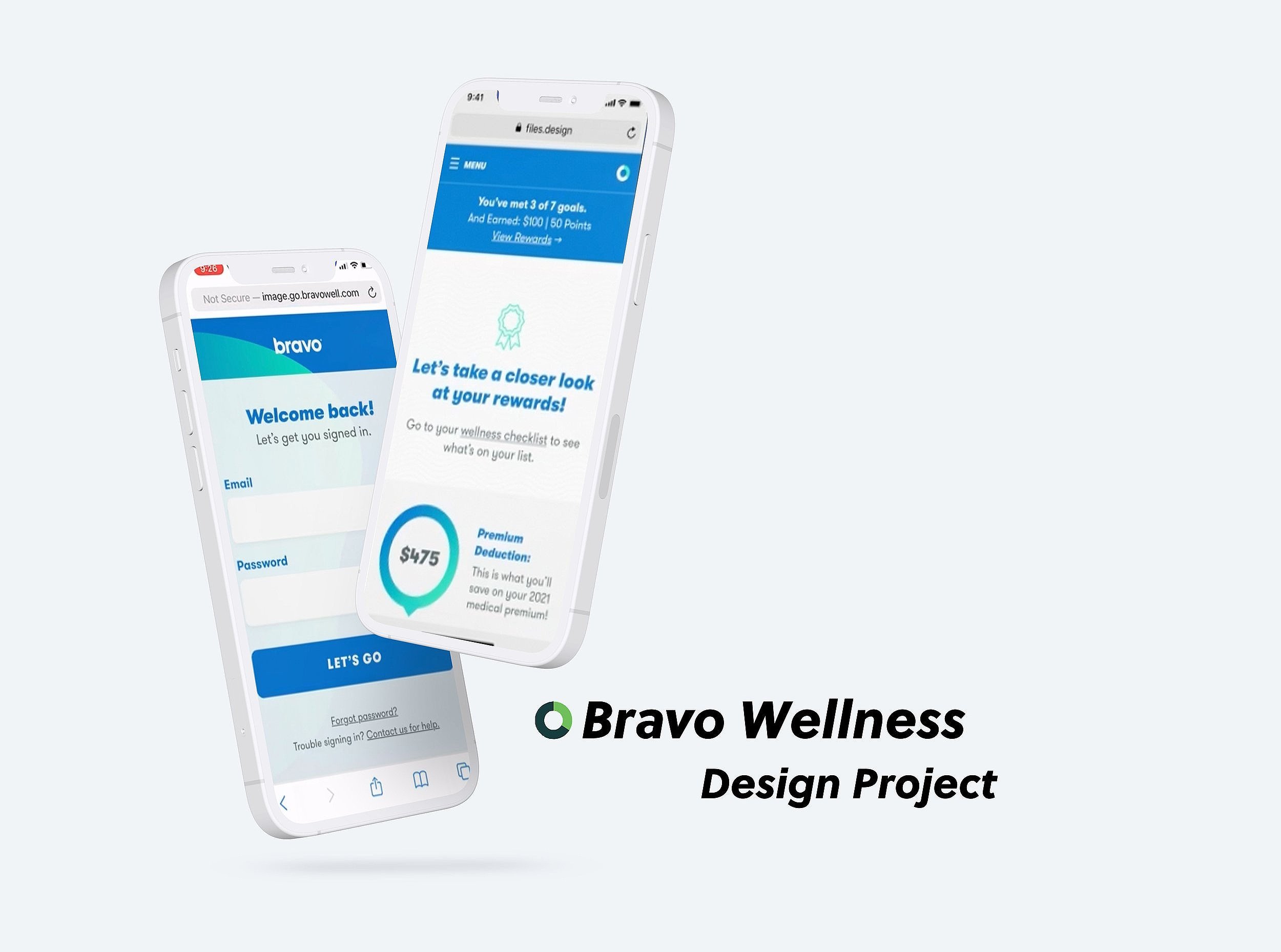
Bravo Wellness Checklist
Bravo's Wellness Checklist serves as the ultimate hub for participants, offering a comprehensive experience that encapsulates a myriad of functions. It empowers participants to:
Complete Tasks: Users can efficiently tick off wellness-related tasks, ensuring that they are actively engaging in their health and well-being journey.
Understand Rewards: The checklist provides users with clarity on the rewards and incentives they can earn through their wellness efforts, serving as a motivational tool for continued engagement.
Compare Wellness Options: Participants gain access to a wealth of wellness information, allowing them to explore and evaluate various options to enhance their overall well-being.
This feature is part of Bravo's commitment to providing participants with a holistic and user-centric platform that simplifies and enriches their wellness experience. It's a powerful tool that empowers users to take charge of their health journey with confidence and ease.
Because this project is currently confidential, some visuals and additional information are not included.

Project Background
We focused on designing and improving the wellness checklist to make our wellness portal easier and more efficient for participants to use. The goal was simple: create a platform that helps people navigate and complete tasks effortlessly, making their wellness journey as smooth as possible.
To achieve this, we stuck to two key ideas: keep it intuitive and keep it minimal. By focusing on simplicity, we ensured the design made sense right away and didn’t overwhelm users, helping them stay on track without unnecessary distractions.
This project was a true team effort. The Senior UX Designer worked closely with the Product and Development teams, bringing together everyone’s expertise. This collaboration not only met participants' needs but also set us up for future improvements to the wellness portal.
Objective
The goal of this project was to give the Wellness Checklist a much-needed update as Bravo transitioned to a new and modern platform. Business stakeholders made it clear that the checklist was a key piece of the puzzle in delivering a better experience for participants, making it a top priority during this transformation.
Communicating a lot of tasks at once—especially in the context of something as personal and important as health—can be tricky. It’s not just about clarity; it’s about keeping users engaged and motivated. To redesign the Wellness Checklist, we focused on these essential pieces of information:
The Tasks: Clear, straightforward task descriptions to help participants know exactly what they need to do.
Rewards: Showcasing the rewards for completing each task to keep users motivated and excited.
Deadlines: Highlighting due dates to emphasize timeliness and keep participants on track.
Task Descriptions: Including detailed explanations to ensure users understood the purpose of each activity.
Parent and Child Tasks: Organizing tasks hierarchically to make objectives more structured and manageable.
Rewards for Child Tasks: Breaking rewards down further to celebrate progress at every level.
By focusing on these elements, we made the Wellness Checklist easier to use, more engaging, and aligned with Bravo’s push for modernization. It wasn’t just an update—it was a way to help participants feel more excited and supported in their wellness journey.
Research
Building on the existing design, the Senior UX Designer and I set out to tackle some key questions to guide our improvements:
What’s Working? We wanted to uncover what users liked about the current design—the elements that resonated and added value to their experience.
What’s Not? Just as important, we focused on identifying the pain points—the parts of the design that frustrated users or didn’t meet their needs.
How Can We Improve the Flow? We explored how users envisioned a smoother, more intuitive experience, aiming to align the flow of the site with their expectations.
What Does Customer Service Say? Feedback from users who reached out for help was invaluable. It highlighted challenges and areas we needed to address to make the platform more user-friendly.
With these questions in mind, the Senior UX Designer and I worked together to dig deep into the insights. Using what we learned, we created high-fidelity designs to visualize our solutions. From there, we collaborated closely with the Product and Development teams, presenting our designs, gathering feedback, and refining them through multiple iterations. This process led to a polished prototype, ready for usability testing to ensure it met user needs.
Design
Designing an interface to help users complete tasks intuitively was one of the biggest challenges of this project. The journey had several steps:
Choosing the Task: Users started by selecting the task they wanted to work on.
Answering a Questionnaire: They then responded to questions related to that task.
Entering Data: This step involved adding information or dates for verification.
Reaching the "Complete" Page: After finishing the previous steps, they’d land on this confirmation screen.
Seeing Responsive Feedback: Finally, the task would update to show as “Complete” in real time.
To tackle these complexities, we created low-fidelity wireframes to test and refine our ideas. Some key improvements we introduced included:
Reward Icon: Adding a trophy icon alongside the point system made the rewards clearer and more accessible for users.
Due Date Highlight: We placed the due date in the top right corner and encircled it for better visibility.
The goal was to make a process—one that’s often seen as confusing or overwhelming—feel simple and engaging. By focusing on a user-first approach, we worked to minimize frustrations and create a design that balanced ease of use with the functionality needed for wellness program participation.

Conclusion
After refining the design and presenting it to the Product team, we worked closely with the Development team to bring it to life. This collaboration was crucial to ensure the design translated seamlessly into a functional and user-friendly interface, bridging the gap between concept and execution.
To validate and improve the design further, we conducted Usability Tests, gathering direct feedback from users about their experience. From there, we created an Affinity Map to organize and visualize user insights, helping us identify if any final tweaks were needed to make the design even better.
What seemed like a straightforward project at first turned out to be a deeper challenge, pushing us to rethink our assumptions about how to best present and optimize the page for users. This process highlighted the power of iterative design, user feedback, and cross-team collaboration in creating a solution that didn’t just meet expectations, it exceeded them.
