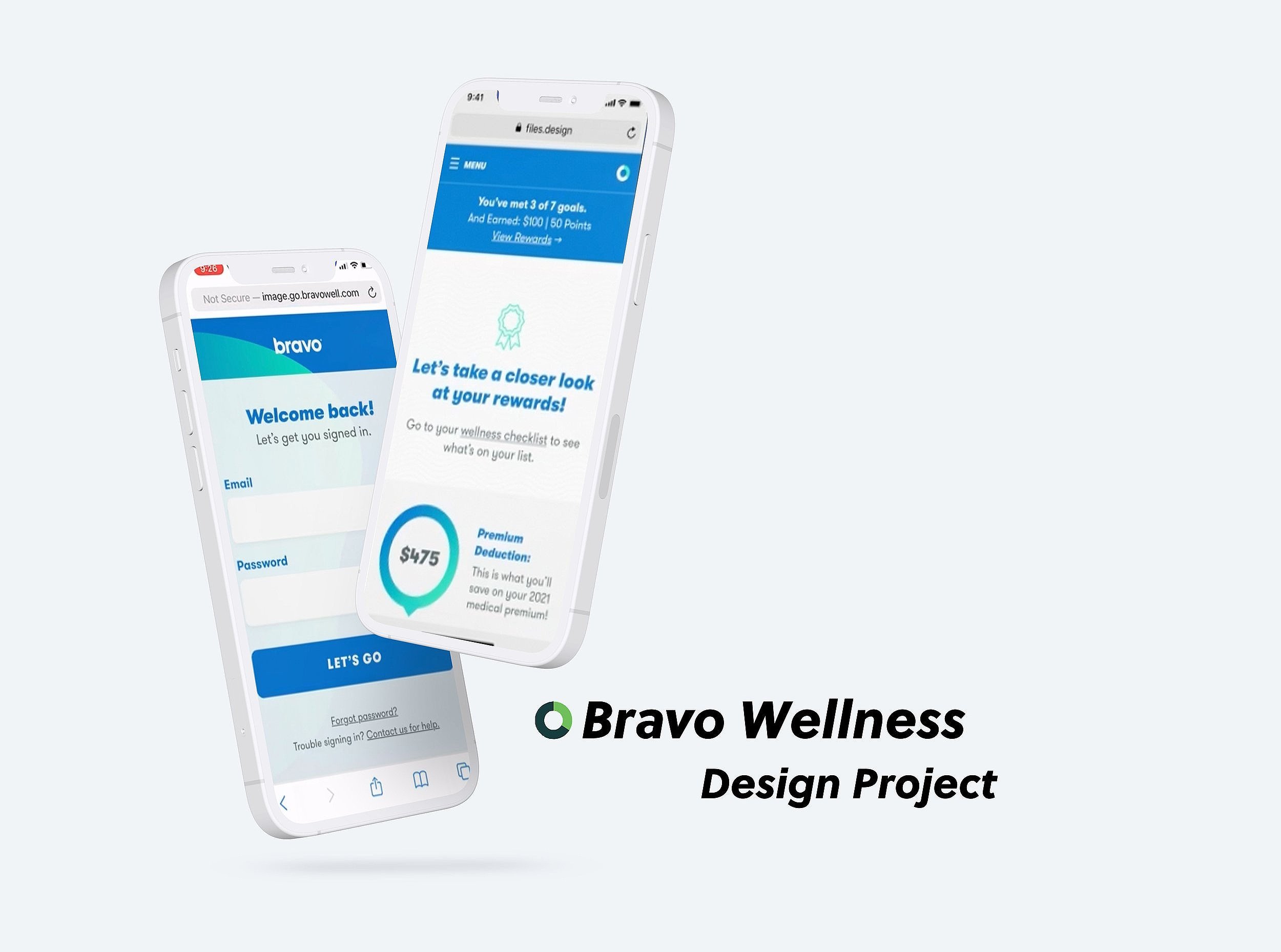
Bravo Wellness Checklist
Bravo's Wellness Checklist serves as the ultimate hub for participants, offering a seamless and comprehensive experience that encapsulates a myriad of functions. It empowers participants to:
Complete Tasks: Users can efficiently tick off wellness-related tasks, ensuring that they are actively engaging in their health and well-being journey.
Understand Rewards: The checklist provides users with clarity on the rewards and incentives they can earn through their wellness efforts, serving as a motivational tool for continued engagement.
Compare Wellness Options: Participants gain access to a wealth of wellness information, allowing them to explore and evaluate various options to enhance their overall well-being.
This feature stands as a testament to Bravo's commitment to providing participants with a holistic and user-centric platform that simplifies and enriches their wellness experience. It's a powerful tool that empowers users to take charge of their health journey with confidence and ease.
Because this project is currently confidential, some visuals and additional information are not included.
My Role
User Experience Designer
Duration
2 week sprint
Tools
Adobe XD, Miro, Aha

Project Background
Designing and optimizing the wellness checklist for participants emerged as a pivotal requirement in the ongoing enhancement of our wellness portal. The objective was clear: to create a user-friendly and efficient platform that streamlined navigation and task completion, setting the stage for a more seamless wellness journey for our participants.
In the pursuit of this objective, our approach was underpinned by two core principles: intuitiveness and minimalism. These principles were central in ensuring that the design facilitated a straightforward and effortless user experience, mitigating decision fatigue along the user's wellness journey.
The project was executed through a collaborative effort, with the active involvement of the Senior UX Designer, as well as close collaboration with the Product and Development teams. This collaborative synergy allowed us to harness the collective expertise of our multidisciplinary team, resulting in a design that not only met but exceeded the expectations of our participants and positioned us for future optimization of the wellness portal.
Objective
The core objective of this project was to undertake a comprehensive update of the Wellness Checklist, a task deemed essential by Bravo's business stakeholders as the organization transitioned to a new, contemporary platform. The recognition of the Wellness Checklist's importance within this transformative change underscored its significance in delivering an enhanced participant experience.
Effectively communicating a multitude of tasks all at once can be a daunting challenge. Especially when it pertains to something as crucial as health, maintaining user engagement and enthusiasm is paramount. In our quest to redesign the Wellness Checklist, we identified key pieces of information that we deemed essential to communicate effectively:
The Tasks Themselves: Clarity in presenting the tasks ensured that participants understood the objectives they needed to accomplish.
Reward for Each Task: Highlighting the rewards associated with completing each task served as a motivational factor, incentivizing users to engage actively.
Due Date for Each Task: Timeliness was emphasized by clearly indicating the deadlines for task completion.
Description of the Task: Providing a comprehensive task description ensured that users were well-informed about the nature of each activity.
Child Tasks to the Parent Tasks: Organizing tasks into a hierarchical structure allowed for a logical and structured approach to wellness objectives.
Each Reward for the Child Task: Recognizing the achievements of participants on a granular level by highlighting rewards for child tasks contributed to a sense of accomplishment.
By focusing on these elements, we aimed to create a redesigned Wellness Checklist that not only simplified the participant experience but also instilled a sense of engagement and excitement in their wellness journey, thereby aligning seamlessly with Bravo's modernization efforts.

Research
Building upon the foundation of the existing design, the Senior UX Designer and I embarked on a comprehensive exploration, aiming to address several critical questions:
What Resonated with Users in the Current Design? We sought to discern the elements of the current design that users found appealing, focusing on what aspects were positively received.
Pain Points in the Current Design: Identifying areas of discontent among users was equally crucial. This involved pinpointing aspects of the current design that did not align with user preferences or posed challenges.
Optimizing User Flow: Our objective was to understand how users envisioned an optimized flow for the site. We delved into their expectations and preferences, seeking to create a streamlined experience that met their needs effectively.
Customer Service Feedback: We also considered feedback from users who had reached out to customer service for assistance. This valuable insight allowed us to identify pain points and challenges they encountered during their interaction with the platform.
Through proactive inquiry and meticulous exploration, the Senior UX Designer and I collaborated to unravel the answers to these questions. This collaborative effort paved the way for translating our insights into high-fidelity designs, allowing us to effectively visualize and conceptualize solutions. Subsequently, we engaged with the Product and Development teams, presenting our designs for their input and feedback. This iterative process enabled us to refine our designs iteratively, making necessary adjustments to create the final prototype that would undergo usability testing.
Design
Designing an interface that allowed users to intuitively complete tasks presented a formidable challenge in this project. The user journey involved several intricate steps:
Choosing the Task: Users had to select the specific task they wished to complete.
Questionnaire: This step involved responding to a series of questions related to the chosen task.
Data Entry: Users were required to enter additional information or a date for verification purposes.
"Complete" Page: After successfully navigating the previous steps, users reached the "Complete" page.
Responsive Confirmation: Subsequently, the task would display as "Complete" in a responsive manner.
Addressing these complexities, our low-fidelity wireframes explored various concepts aimed at serving users optimally. Several enhancements were incorporated, including:
Reward Icon: We introduced a trophy icon alongside the point system to provide users with clearer communication and improved accessibility regarding the significance of the point system.
Due Date Highlight: To draw immediate visual attention, we positioned the due date in the top right corner, encircled for emphasis.
Our ultimate goal was to craft a design that simplified a process that many participants often found challenging—the active engagement in wellness programs. Throughout the design process, we remained acutely sensitive to potential user frustrations that might arise during task completion. This user-centric approach ensured that the final design struck a balance between functionality and user-friendliness, addressing the unique challenges posed by wellness program participation.

Conclusion
Following the refinement of the design and its presentation to the Product team, our collaboration with the Development team was instrumental in ensuring that the design could be effectively translated into a functional and coherent interface. This synergy between design and development was pivotal in bridging the gap between concept and execution.
To further validate and fine-tune the design, we conducted Usability Tests, actively seeking feedback from users to gain deeper insights into their interactions with the site. The resulting Affinity Map served as a visual representation of user feedback, aiding in our assessment of whether any additional refinements were necessary to enhance the design.
In summary, while this project may have initially appeared straightforward, it posed a unique challenge—requiring us to reassess our assumptions about the optimal presentation and optimization of the page for the user. It was a testament to the value of iterative design, user feedback, and collaboration among multidisciplinary teams in crafting a solution that not only met but exceeded user expectations.